Wednesday, August 30, 2006
More Scott crammed down yer gullets.
I'm back again. Now that I'm handi-capable instead of... well, like Jeff, I'm having glorious fun posting pictures and I demand with the arrogance of the gypsies that you look at them!
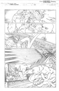
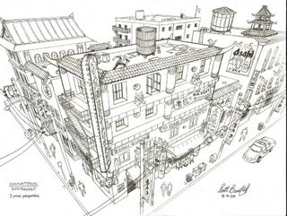
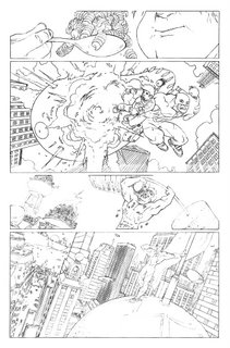
Here's some more graphic novel pages (the full title will eventually be "The Life, Death, and Life of Michael Midas: Champion of the World". Seriously.) as well as an environment I drew while trying out for a job at Activision.
That's it. Remember, certain cheeses can be delicious.
Oh, and I still think I'm a virtual walking poo. Unlike Ellis, who is as cool as it gets.
Tuesday, August 29, 2006
More CRAP!
Ah HA!
Sample C-Edge Cover ...
Some of y'all may know that waaaay back in the day I did a lot of Computoredge covers ... all black and white (it was the pre-color era) and most looking like they were inspired by "The Watchtower" publication ... Well, now that I'm inspired to sketch and paint again I thought it would be fun to see if I could make up some samples to wave at Eeka, the art director for the publication. More of them (and an earlier version of this piece) are available for viewing at my online gallery page. The upshot is that Eeka liked what she saw and will soon test me out with a black and white illustration for an inside article in the near future ... It never pays to ask; the worst anyone can say is no ...
BTW: there are still some touches I'd like to do to this piece (add more "plating look" to the computer console and monitor frame so it blends more with the keyboard segment, as well as some additional shadowing behind the monitor's base section so it seems more defined and attached to the computer case section) ... Comments welcome.
Scott and his posting impotence.
TuesdayArtGroup
Jeez, I hope I'm doing this right. Everytime time Ranjo tells me how to post I won't post and then end up forgetting HOW to post so when I finally WANT to post I can't post.
I'm trying to add a drawing I did for pre-production illustration work for a potential Edgar Rice Burroughs film based on "The Pirates of Venus." I'm dragging and dropping a picture on to this message (although I think that's the wrong way) so if you get text with no picture somebody let me know (again) the proper way. If you get picture and no text then this whole conversation is moot and pointless. And if the latter is the case let me say that I think Ellis is a poophead.
OK, here goes...
Monday, August 28, 2006
Friday, August 25, 2006
Brush Pen Pt.III
Thursday, August 24, 2006
Tuesday, August 22, 2006
Pulp Magazine Cover
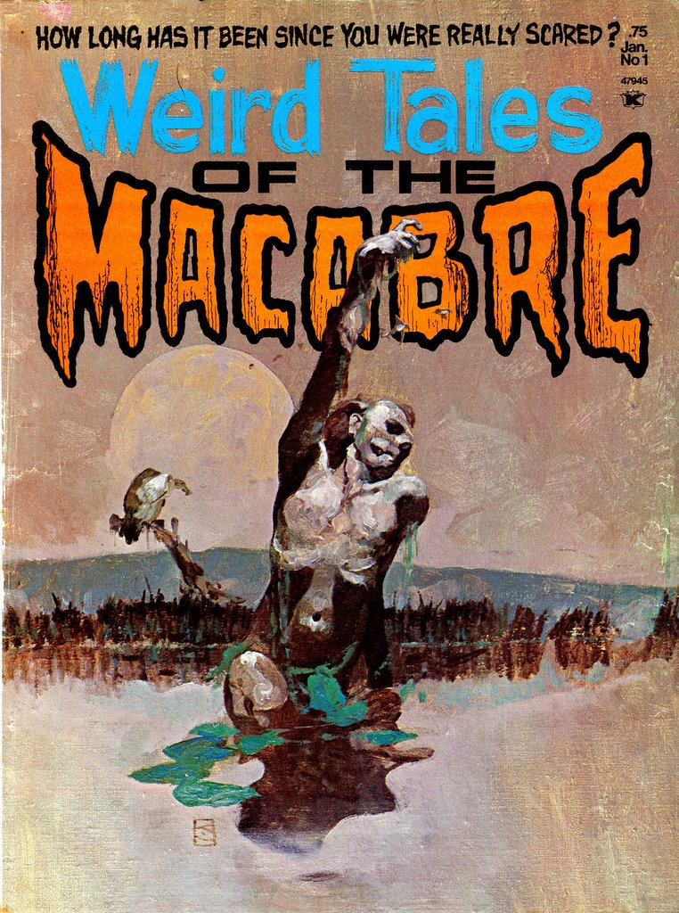
That guy I linked to below, DataJunkie, has all those great Pulp covers. I'm going to paint this thing but I'll use one of those pulp covers as a layer and straight up use it's lurid (but pleasingly complementary) color scheme. Then take it into the ART RAGE program and give it an oil look. Wish me luck.
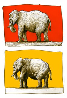
I started on the color last night. I brought in the color scheme of a pulp magazine and it was cool because it made me think about the color another artist had chosen. For instance I realized I can only go darker with that red on the elephant. The bright red is the lightest red. If it was me usingred, I'd mess it up by making a selection in photoshop and lightening. But studying the other artist, I realize that red should be the lighest the red gets.
I've Included the cover I got the color scheme from
Monster Post
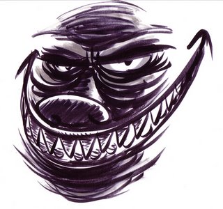
Yesterday, contemplating the doctor's removal of a little cyst on (in) my cheek, I doodled this bumply monster face. Unfinished, it's still a decent Tuesday art post (while I'm searching out some good generational photos ...). The creature has a round nose "hole" because I started it out as a front view of one of my "gun nose" people, but it mutated into a standard monster instead. I'm not sure if I'll go back and retrofit a new nose or not. Time will tell.
BTW: Good on ye, Tom M. and Ellis! Very interesting views through the past.
;-)
Monday, August 21, 2006
Rick and Marty's Theory of Generational Anatomical Change Part2
My Dad as a Kid upper left. As a mature adult and as a man about 20 years older than I am now.
Below, me as a kid and me recently. Baldness skipped me. I'm a great example of never really achieving the look of an adult. Dad grew up during the depression. The worn out over-alls and bare feet aren't cute poses. Like Tom, I never missed a meal.
Unhealthy passion for fantasy on display. Shaved my head to be in a movie about Mothman
The Secrets of Wally Wood REVEALED!
Joel Johnson generously shares hi-res scans of Wally Wood’s “22 Panels That Always Work.” The instructional illustrations were given to incoming artists at Marvel Comics, where Wood was once an artist and editor.
Once shrouded in secrecy, Wally Wood would selectively give assistants and those close to him three 8×10 photocopies of comic panels that bore the absolute essence of drawing comic book panels. 22 images in total, they held the secret to a comic book illustrator’s success, and those who learned from them benefited from the master’s wisdom. The panels were gold, but were not packaged in such a way that was easily disseminated.
(stoled from drawn.ca)
Sunday, August 20, 2006
I just felt like drawing elephants.
It's just two elephants... or the same elephant twice. When Rick was visiting, his daughter Denise one day out of the blue, started telling me the tale of the six blind men and the elephant, and then went on to explain the moral of the tale. So I've had elephants on the mind since then.
Hey, if anybody wants to read a really interesting, free online comic book on copyright law and fair use go here:
http://www.law.duke.edu/cspd/comics/
It's actually about fair use in documentaries, but it's relavent to all the visual arts. Months ago some of us were having a discussion of Marvel's lawsuit against City of Heroes and what the true goal of copyright protection should be. I think that point is covered eloquently here.
Rick and Marty's Theory of Generational Anatomical Change
Hmmm... well I do think people look physically different from generation to generation for a number of reasons beyond style. Improved diet and a different lifestyle has made a difference in body types, and of course what's considered attractive from one generation to the next can change. Marilyn Monroe looks soft compared to the "abs-of-steel" girls of today.
Being fat used to be a sign of prosperity when excess food was a luxury. Now, food is common; there's too much food. Thinness is the status symbol.
A fair complexion used to be the sign of the upper class that didn't have to work in the fields. Nowadays a good tan shows you spend a lot of time out on the tennis courts or the golf course.
But the differences that Rick and Marty sense may not all be strictly anatomical. That's my grandfather on the left, my dad in his fifties in the middle, and me on the right at about the same age. Obvious differences of hairstyle and clothing aside, I think they have more of an air of being real "adults" somehow.
It might have something to do with the way people carry themselves; the way they "project" their experiences in life. My dad was born in 1914 and picked fruit as a teenager to help the family get through the depression. His dad had to flee the Japanese in Korea, and go from being a scholar to a field laborer here. Whereas I grew up never having to worry about where my next meal was coming from. Do their harder lives show in their eyes? It seems like the kind of thing a good actor could convey through subliminal body language thus making themselver look "physically" different.
So does your theory have something to do with factors beyond these that I've mentioned? Some actual physical evolution?
Saturday, August 19, 2006
Cool Blog, Lots of Art from My Childhood
I thought this was cool, a Jeff Jones piece I had never seen. It's obviously a careless quickey, umber clearly showing through, sloppy as hell but kinda neat. Here's the site.
http://datajunkie.blogspot.com/2006_01_01_datajunkie_archive.html
Tons of oddball stuff that was being sold to the child of the 60s.
Wow, I dipped into his archives. Check out the Wally wood in March. And Marty, a ton of Kirby as well.
http://datajunkie.blogspot.com/2006_03_01_datajunkie_archive.html
Friday, August 18, 2006
Thursday, August 17, 2006
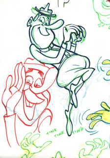
Ranger Smiths
More Fun With Brush Pens!
Wednesday, August 16, 2006
Hey, What happened to the settings?
Is it you Skrbbl? Most of us have admin privelege I guess.
Copy and paste this Skrbbl
EDIT: Thanks Mr. Goodson! Got it!!!!
Copy and paste this Skrbbl
EDIT: Thanks Mr. Goodson! Got it!!!!
Tuesday, August 15, 2006
Last "Slow Death": Staff Page w/Sheridan artwork
Monday, August 14, 2006
"Slow Death" page ...
I post this because I was reminded of the last panel when I saw Rick's guy with a roaring head in his abdomen ... Naturally, since this is a family-friendly site, I've deleted a particular word from the joke ... I have a feeling most will still "get it." '70s Underground comics ... oh yeah ... BTW: this issue had a really great story from Corben ...
And here is the final page, Tom M. (and others). I'll bring the whole comic to next year's Con! ;-)
Sunday, August 13, 2006
Guest Appearance
Check out Chippy and Loopus and have a look at the "Diaper Genie"... look like anyone you know?
http://chippyandloopus.typepad.com/
Heh...
http://chippyandloopus.typepad.com/
Heh...
Saturday, August 12, 2006
Jimmy Bowles Against The Blues
A page of Jimmy. Just done straight ahead, with no planning, as an entertainment excercise fer myself and the young'ens.
Maybe my real calling is as a babysitter/comic creator. I seem to do my best work that way (Tom Moon, you hit that nail on the head with your comments on "Herman's Hogan").
As with "Herman's Hogan," this was done to impress kindergarteners (my kinda public!), and executed on a piece of printer paper with wobbly inking via my trusty Muji brushpen. Unlike the too-hasty execution on Herman, this one had pencils underneath.
You'll notice that I am still struggling to draw good underwater scenes (it's the opaque tendrils of ocean effluvia that are beyond me right now--y'know, the little "current" most comic artists weave in and around their underwater populations-- I just can't get it right--it always looks like exploded octopus parts with me). But my surface waves are improving. I came up with the name Zubi, and little Harry, my half-brother-in-law, came up with Wendell (!).
Kowabunga.
Wednesday, August 9, 2006
Scanner Setting Comparison
Herman's Hogan, page 2
Tuesday, August 8, 2006
Herman's Hogan, page 1
The Horror
Someone else does a caricature of me. Better than the one Stephen Silver did of me.
Of The new muli-image caricatures, The Silver caricature is one a lot of you saw at the con. The Gary Meyers caricatuire is an attempt at recreating from memory all the awful aspects of the Silver caricature. Liver spots, balding, mal shaped nose etc.
Sunday, August 6, 2006
Sketches Over Scotland ... ;-)
Greetings, everyone.
Here are some of the sketches that resulted from the Scotland trip ... I tried for about one a day, so what I did had to fit around mountain climing (Stac Pollaidh, est. 2000 feet tall), hill walking, a ferry boat trip, beach jaunts, etc. BTW: the weather was in the balmy mid-80s and only two days had any rain. Scotland! The vacation paradise!!
Check out PitchScribbleRant (my blog) for another five sketches ...
Feedback welcome.
Subscribe to:
Posts (Atom)