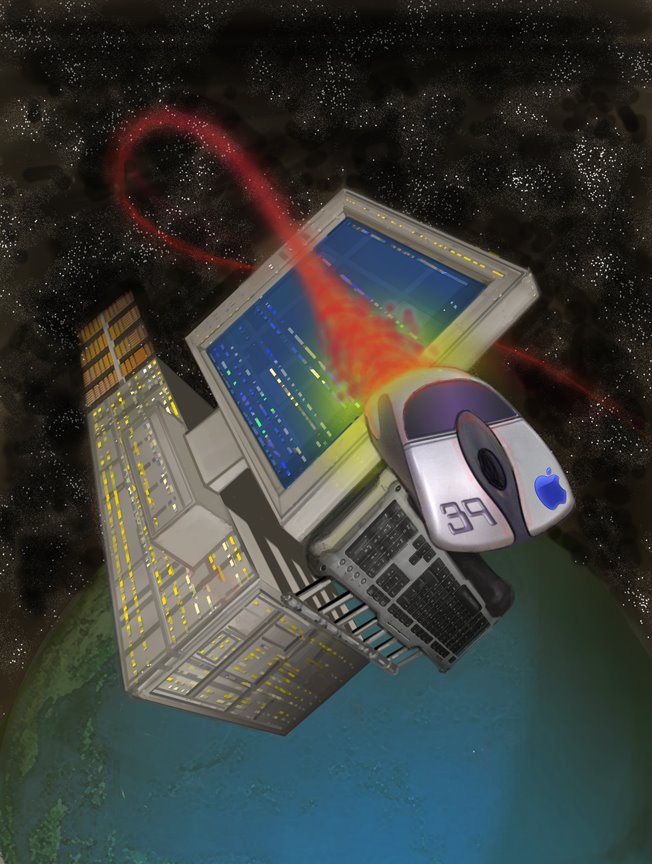
Some of y'all may know that waaaay back in the day I did a lot of Computoredge covers ... all black and white (it was the pre-color era) and most looking like they were inspired by "The Watchtower" publication ... Well, now that I'm inspired to sketch and paint again I thought it would be fun to see if I could make up some samples to wave at Eeka, the art director for the publication. More of them (and an earlier version of this piece) are available for viewing at my online gallery page. The upshot is that Eeka liked what she saw and will soon test me out with a black and white illustration for an inside article in the near future ... It never pays to ask; the worst anyone can say is no ...
BTW: there are still some touches I'd like to do to this piece (add more "plating look" to the computer console and monitor frame so it blends more with the keyboard segment, as well as some additional shadowing behind the monitor's base section so it seems more defined and attached to the computer case section) ... Comments welcome.
This is great! Eeka likes bright colors and I think this image qualifies as bright!
ReplyDeleteI think my best Computor Edge covers are the ones that don't feature computers as part of the imagery. If I can convey the message without a monitor or PC box in the image, I feel pretty good. It's not always possible, but that's usually my goal.
Congratulations on getting the illustration work Tom. Your painting would certainly make a beautiful cover!
ReplyDeleteYou point about bright colors is well taken, Rick. I actually don't think this is a bright as 95 percent of the covers I've seen ... The other cover I completed halfway is a more traditional cover ... with brighter colors. :-)
ReplyDeleteI dig it Tom. Eeka! talk about your blast from the past. I think this piece will get you work. Good staging, eye guiding piece
ReplyDelete